Redesign VIVO PAP Turbo
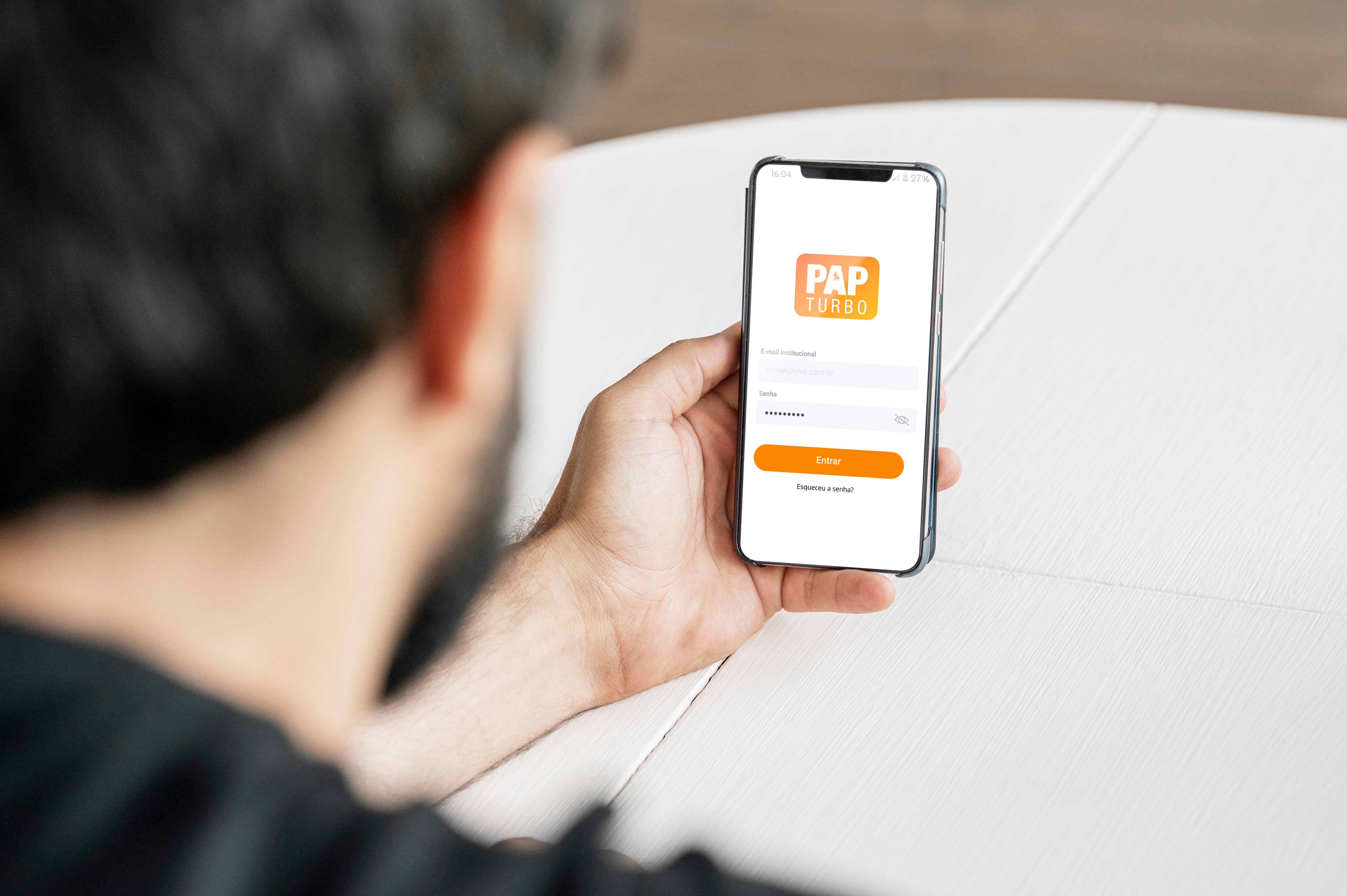
This project is about the redesign of the Vivo PAP Turbo mobile application, which is a support app for Vivo business fiber optic sellers. Where I rewrite the app based on user experience principles.
User research, usability analysis, prototyping. I worked together with a product manager and the developer to prioritize the product requirements.
The challenge
The Project is currently in the MVP phase, -that is, it has only the essential features, simplistic design and a limited number of users.
I was given the challenge to work on the Design of this App, before expanding the project to more users.
The main objective of this app is to speed up the process and organize the information, because now several steps of the process such as 'Appointment' and 'New Sales' are done through messaging applications, like Whatsapp, where information sometimes ends up getting lost.
Main objectives of Redesign
Map usability issues
Create a visual identity
Define and prioritize product improvements
Time
1 month
The design process
Process based on the Double Diamond methodology of Design Thinking.
Discovery — Definition — Development — Delivery

Introduction
The Project is currently in the MVP phase, -that is, it has only the essential features, simplistic design and a limited number of users.
The Project is currently in the MVP phase, that is, it has only the essential features, simplistic design and a limited number of users.
I was given the challenge to work on the Design of this App, before expanding the project to more users.
1. Heuristic Analysis
Analyzing the interface of the PaP Turbo Application, I noticed that attention was paid to Design, the App contains good iconography, fonts and colors, but it did not meet some of the basic principles of interface design and that's why I decided to apply the 10 heuristics of Jakob Nielsen (computing scientist) to show what can be improved in the interface and consequently in the user experience. I limited myself to mention the heuristics which the application violates.
3rd User control and freedom
The App forces the user to use the mobile landscape mode on several screens. Furthermore, the system does not present the user with an “emergency exit” from the state in which he entered to the safe state he was in.
4th Consistency and standards.
I found some examples where the patterns of interactions diverged. Some evidence was documented below:
Inconsistency in the display of action buttons and spacing in some cases.
5th Error prevention.
About many form fields, formatting is not automatically applied. It is also important that there is a confirmation of the data before it is sent to avoid errors.
8th Aesthetics and Minimalist Design
Lack of text alignment and insufficient font weight to highlight the data:
Inconsistencies with good interface design practices through too little spacing in titles:
9th Help users recognize, diagnose and recover from errors.
When users fill in form fields incorrectly, the system does not return an Instant Feedback
2. Qualitative analysis of the service
Considering that when using the application I found problems related to heuristics and that reflect my opinion of what is good or not in an interface, I decided to do a qualitative research to validate or not the dysfunctions found and analyze other opinions about it with the objective of bringing users to the center of problem solving and collect their insights, listen to their pain, and try to recognize patterns of use.
This research took place through semi-structured interviews with 5 people. I asked questions aimed at getting to know the users' routine better, their behavioral profile and what they expected to find in an application like 'Pap Turbo'.
The insights generated from this research will be exposed below:
Insight 1
It is expected that the application as a whole will make the process more agile for the seller, reducing contact points to just what is necessary;
Insight 2
Most respondents relate the quality of the service to the appearance of the platform.
Insight 3
The user needs better Feedback regarding the processes. Know the Status of your inquiries and sales, to have more predictability in your day to day.
Insight 4
For Stakeholders, this application means better process control, reliability, metrics generation, information security and time savings.
Insight 5
The most used features of the application are “New sale”, “New query” and “Sales list”.
3. Benchmark
After the qualitative interviews, it was possible to show which are the most considered points when choosing the platform and the preference of this sample of people. Therefore, the 3 considered the most important were used as a criterion for the benchmark in order to better understand the positioning in the market and thus be able to better serve them through redesign.
Evaluated criteria:
- Agility in the process;
- Design and usability;
- Differential features.
PedidoOK
This is a very popular App, today with more than 100,000 downloads on Google Play alone, it is an App focused on Sales Teams, Commercial Representatives and independent sellers. The process is agile, with practically all the options being accessed directly from the home screen, or with a few easy-to-learn steps. Despite this, the Design fails in the aesthetic part.
The differentials are on account of Team Management directly through the application, and in the detailed performance reports.
Mercos
Fully integrated into the Web system, Mercos has a strong visual attachment to minimalism. Right after the first access, the user is directed to a tutorial in the “walkthrough” model in which the App highlights the buttons and describes them. This application stands out for its robust ERP integration and in-App Chat support.
Super Revendedores
Despite not being a direct competitor, Super Resellers is a very famous application in the direct selling sector. The App separates customers by profile, presents all products to the seller very efficiently. Very didactic in use, with very well ranked content, this application definitely replaces the direct seller's agenda.
4. Categorization of Problems x Possible solution

5. “Sketch Frame”
This was the first step in the process that helped me get the idea out of my head and visualize the solution in the form of an application.
Home Drafts + Crazy 8
Sales Outline + Inquiries
6. Low-fidelity wireframe
The next step was to develop the low-fidelity Wireframes. Alluding to Civil Construction, this step represents the floor plan of our solution.
User flow
7. Creating an visual identity
Style Guide
In order to create a unique identity for the app, the visual design was created based on the following values:
- Safety
- Autonomy
- Innovation
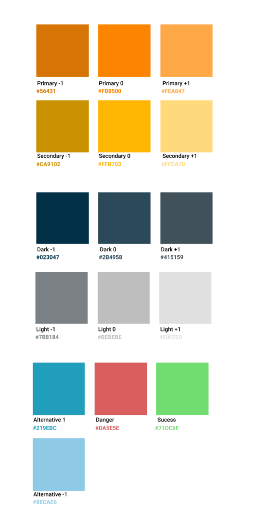
Color palette
The Color Palette represents the values we aim for in Innovation and Autonomy:
- Orange as a primary conveys the idea of movement and desire for action, in addition to being one of VIVO's colors.
- Blue tones and light versions help brighten the interface and improve focus.
The Contrast Rating (WCAG) of the colors used in titles and body is 9.56:1 9.56:1
Typography
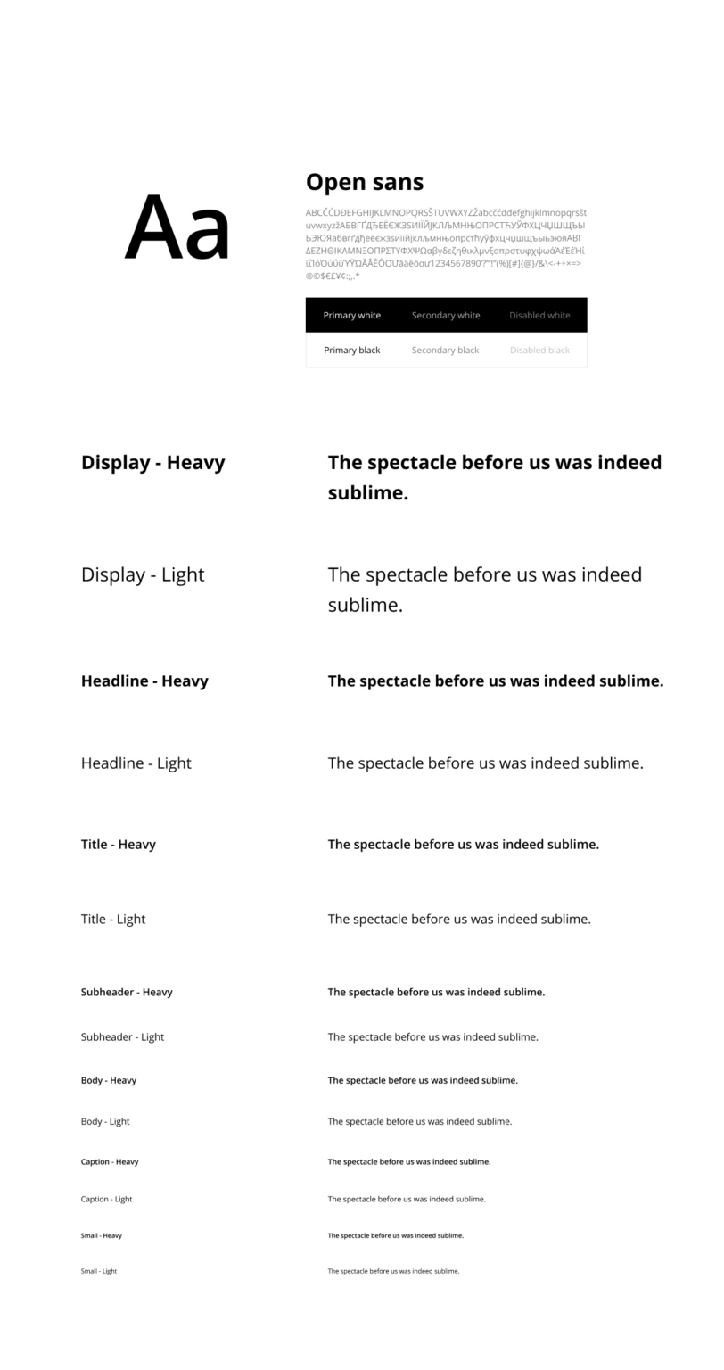
Was used the standard version of the Open Sans font, in different sizes and weights to increase the dynamics of the pages and the reading.
Forms
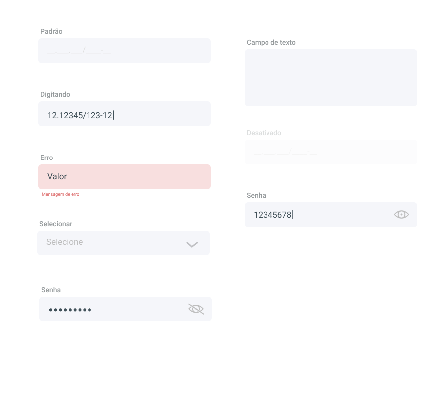
For the forms, I looked for a field format that is visually clean, but that also delimits the fields well in order to keep them accessible for different user profiles.
Icons
I choose to use Microsoft's “Icons Fabric MDL2″ library because it is a well-validated library with sober icons and clear lines.

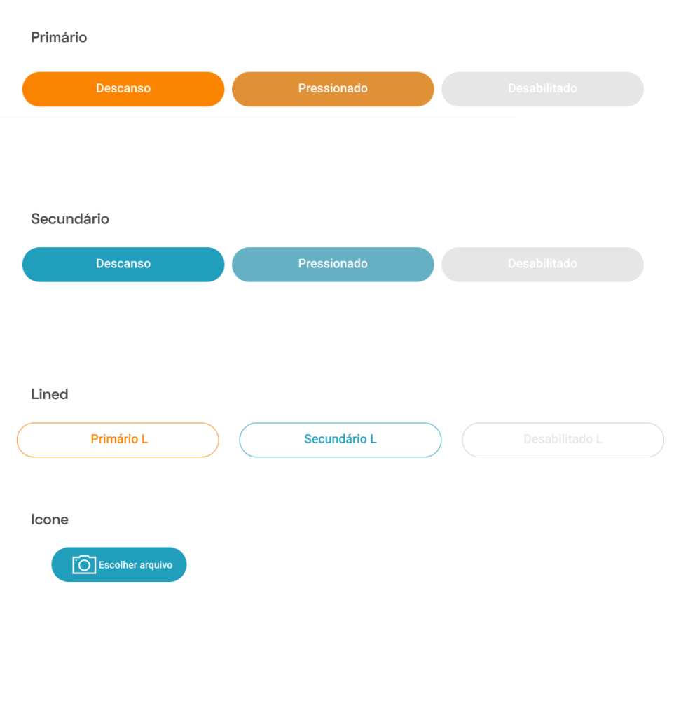
buttons
I decided to use rounded buttons to break the rigidity of day-to-day operations in order to provide an easy-to-use feel.
System Design & Scalability
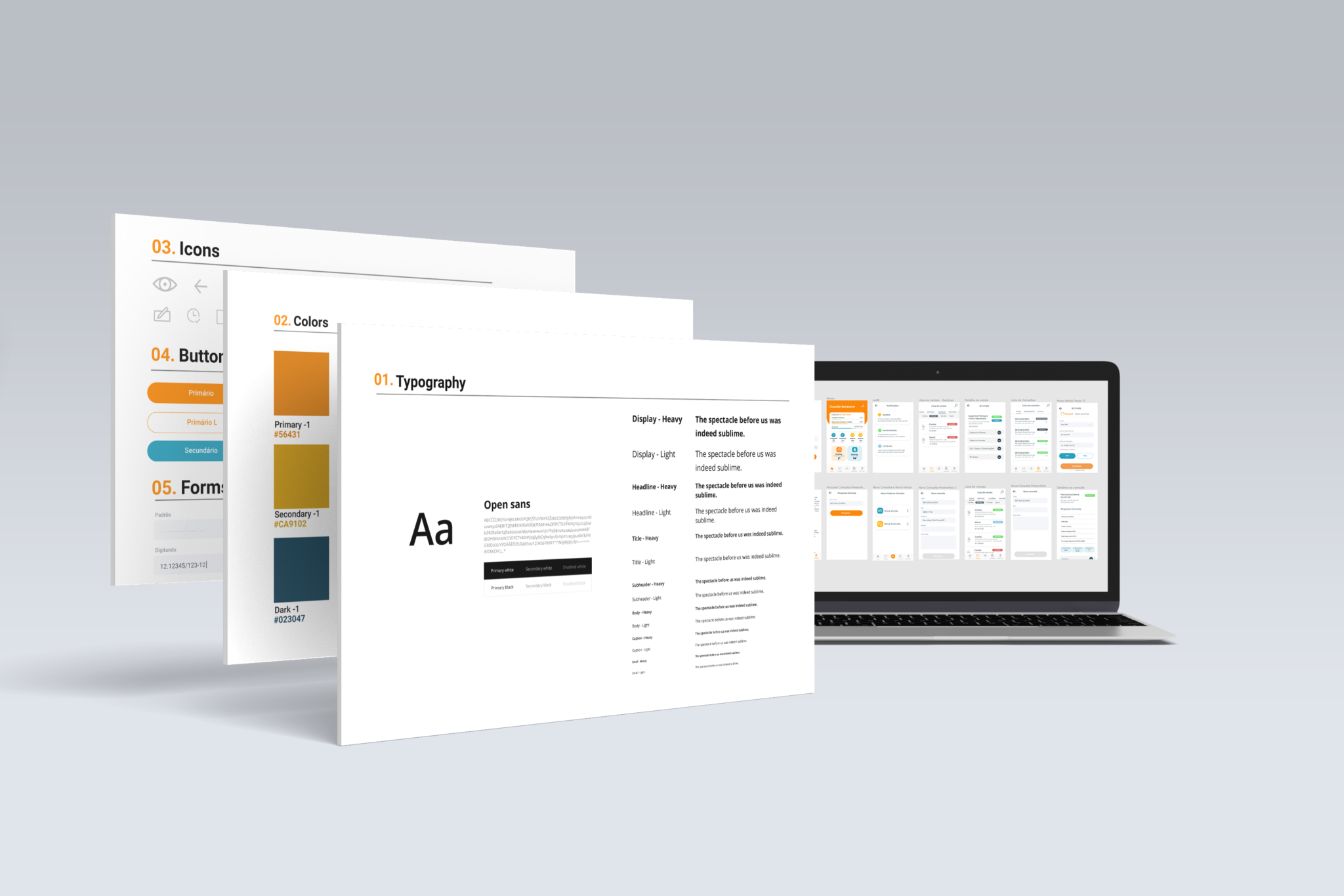
All interface components such as fields, buttons and their states, icons, color palette, typography, etc. were documented and designed to be scalable and reused, facilitating implementation and long-term management.
8. Redesign
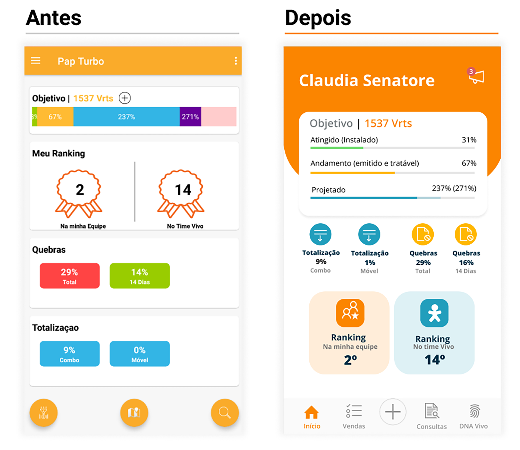
Next, I'll describe the changes to some of the most used screens, I've made heuristic changes, and added features to improve the end-user experience.
Home
The menu has been moved to the tab-bar style, standardizing the icons. The Goals and Vrts chart has been remodeled so that the visualization is more playful. The home was designed so that the most used features are accessible directly from the home screen.
Sales List
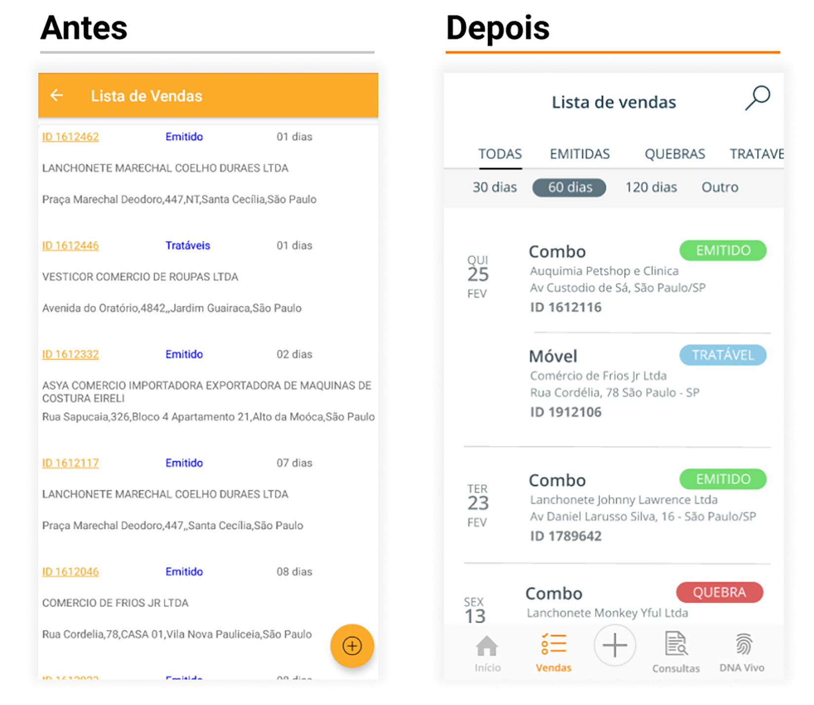
The list is now organized by date, in addition the data is more understandable with tag colors and better separation of the list. Regarding the functionalities, the need for filters was seen, thus eliminating the need to have another screen than what was in the App called “Breaks”. Finally, a search option was added to make it easier for the user to find a specific sale.
Sale details
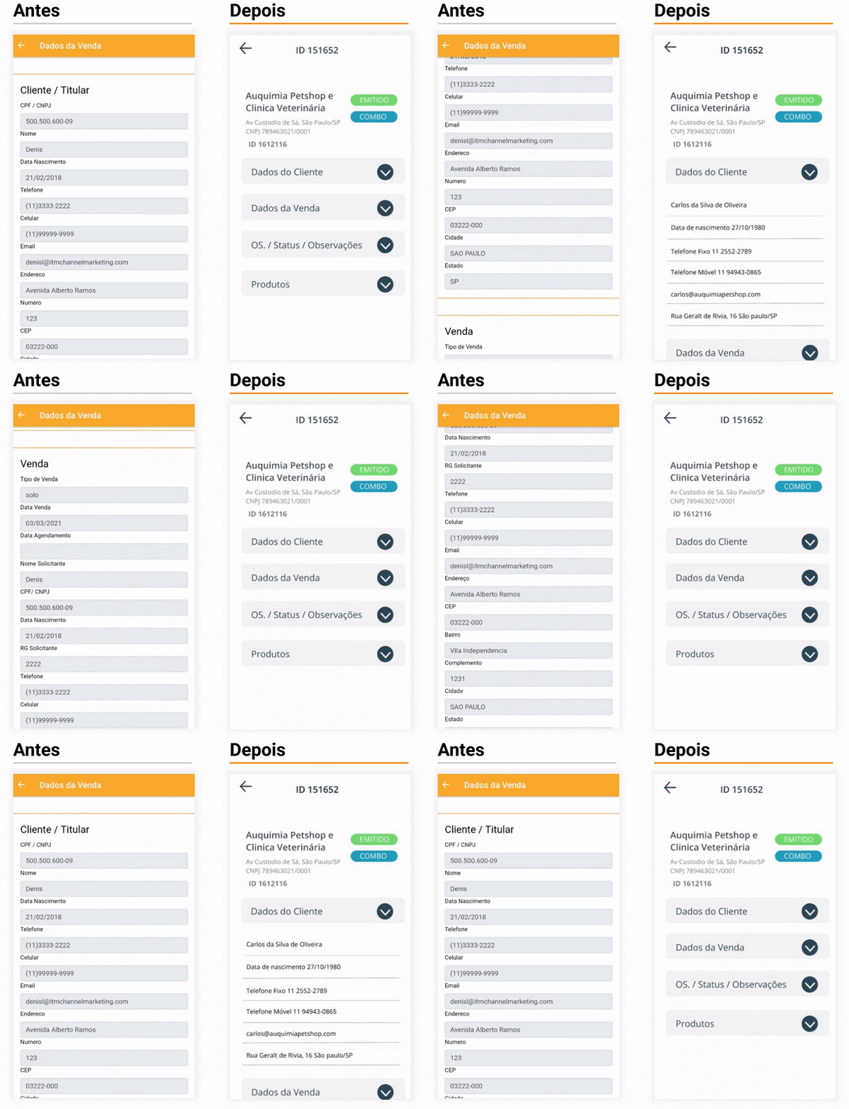
Before, it was a form filled in for visualization, in the new version the data are organized hierarchically where the main ones were at the top and the others were made available through an accordion, in this way the user only visualizes what is necessary. hierarquicamente onde os principais ficaram no topo e os outros foram disponibilizados através de um accordion, desta maneira o usuário somente visualiza o que for necessário.
New sale
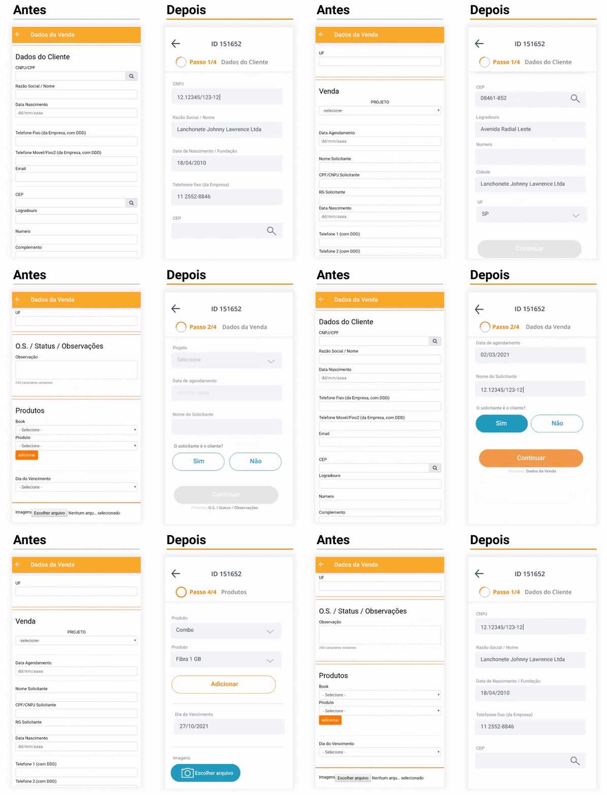
This screen has been remodeled so that the form filling becomes step-by-step, in addition to that, the fields were organized to be dynamically displayed, for example: if the requesting person is the customer himself, he does not need to type the data again and the address fields are only shown after filling in the zip code, speeding up filling.
Next steps
The next step is the Development of new features that are in the Application Roadmap such as:
- Lead List
- Sticky notes
- Rotas/Mapas
- Field research
After the addition of these new features in this UX project that are in progress, it will be time to carry out the usability test where we will measure metrics such as 'average completion of the objective' time, with the purpose of even before coding the new features we have the opportunity to make adjustments and improvements to the Application Design.
